Exploring the shifting space between Handwriting, Calligraphy and Graffiti.
This work explores a number of ideas. The most significant is, how to make public text based artworks that engage with a wider public but also acknowledge marginalised and disenfranchised communities. Embedding this inclusivity in the design process may provide a blueprint about how to design out vandalism and grafitti. It’s a mix of my own research and opinion.
The text is divided into three sections. The Everyman Theatre Liverpool, Tate Liverpool and Kings Wharf.
It represents a number of projects, workshops and interviews. It begins with a large public Artwork which was part of a redevelopment on Hope Street. It documents my writing experiments and collaborations with Tate Liverpool. It ends with a large public Artwork commissioned by Dong Energy and Robertson Construction.
In addition to these very public experiments , my own experiences have shown that you can use writing mechanisms to inspire students to engage with cultural institutions and explore the notion of drawing and learning.
Drawing and the process of making marks, working in a tangible way to explore learning. There is a convergence of thinking which challenges the idea that handwriting is an indicator of intelligence in young people. It’s really about how young people approach this subject. It’s not just about clever kids having good handwriting skills.
 Handwriting A National Survey / Reginald Piggott 1957
The frightening increase in illiteracy begins with the neglect of handwriting in schools Gerrit N, The Stroke: The Theory of Writing, Hyphen Press 2009
EVERYMAN
In 2012 I was asked to come up with a design for a series of external billboards.
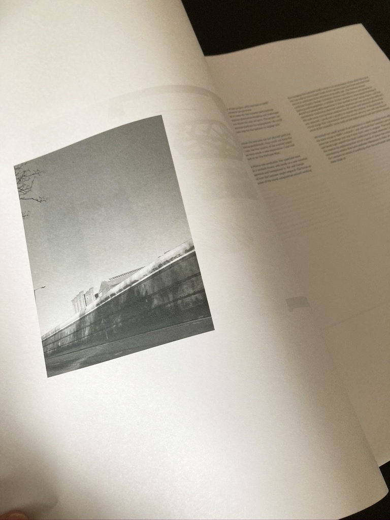
The Everyman Theatre in Liverpool was being completely rebuilt. As a public funded building, They needed a 16 board graphic that hid the construction work but displayed a positive message about and to the City of Liverpool. The Artwork was commissioned by Liverpool Design Agency Uniform. Level 5 / second year Illustration undergraduates were asked to produce a series of Black and white Photographs, based on the concept – Our City. The photographs ranged from oblique tourist vistas to details and textures from all over the city.

The Everyman team supplied a selection of first lines and quotes from famous Everyman productions. The text provided a counterpoint over the existing duotone photographs. The writing style and approach was inspired by the script based loops and flourishes of the tags (The repeated use of a symbol or image to mark at territory) found in some streets and alleyways within a quarter mile radius of the site. This style of tagging divides opinion. Sometimes it’s clumsy and regarded as vandalism. It’s often driven by getting your name seen. The repeated multiple name tags. A repeated mantra. In New York in the late 1970’s having your images on a train which ran across Manhattan and the Boroughs was often an indicator of an artists profile. The quality varies, some of these signatures have a sophisticated and confident mannerism, they have a real confident that comes with years of practice. Ask most grafitti writers in the city about why they tag wall. The responses are based around ‘ getting your work out there’. I’ll expand on that idea, later in the text. It’s definitely a form of exhibitionism. But one that appreciates and acknowledges skill and technique. There are parallels between the behaviour of these groups and skateboarders. Both don’t like to recognise rules. Both groups adapt their behaviour to the Architecture of the city. The degree of skill executed in some of these marks is redolent of some of the very best drawing. One of my main inspirations was Rembrandt’s A Young Woman Sleeping. A small brush study of Hendrickje Stoffels painted in 1654. This painting is assured and exact. A moment in time. These recent works are made very quickly but like a skilled drawing, they are practised and repeated over and over again. It’s the repetition and practice which gives the grafiiti exponents, their expertise.

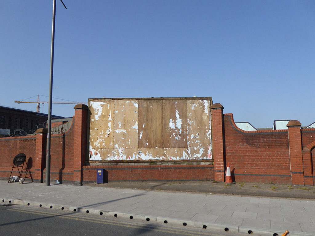
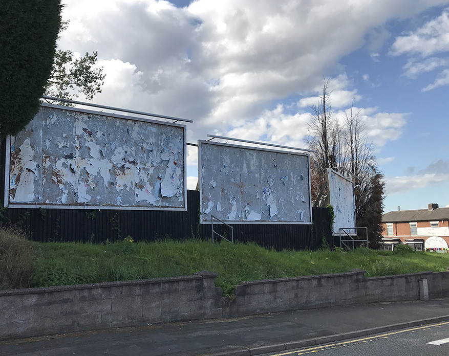
One of the ideas was to adopt a certain type of stylistic language, found the Liverpool street grafitti, to prevent the billboards becoming tagged and vandalized. I believed that if the visual language acknowledged some of the ‘found’ calligraphic styles this would also create a sense of ownership, and as the Everyman project demonstrated, it would be less likely to be defaced. The boards were in place for more than 18 months; the artwork was left untagged.

A similar hoarding at the redevelopment site of the Philharmonic Hall was tagged with one week of the site going up. Both buildings are located on the same street. Within Art and Design Practice there is a resurgence in traditional calligraphy. There is also huge interest in Sign Writing and The Better Letters Organisation is at the vanguard of this. I attended a class by the legendary American Sign Writer Mike Meyers in Nottingham. For the students It’s about getting the balance right, getting the students not to be intimidated by the so called formal qualities of calligraphy. That at least was a start.
KEY WORDS and LIVERPOOL TATE
This project began with three groups of students from three different Liverpool schools. I tried to identify kids from different socio economic backgrounds – Merchant Taylors Girls School Crosby; a fee paying school based in Crosby. Alsop High School; a state funded school in Walton, Liverpool and Formby High School; another state funded school in Sefton. I wanted to develop this idea of getting students to think of handwriting in less conventional academic terms, get them to think about the link to drawing and self expression. I created an A3 page with a grid system, using a basic standard and italic text guideline.

The students produced a response to these sheets – writing and producing a calligraphic response to a piece of accompanying text. The texts offered, ranged from a part of a contemporary song to a section from a poem or verse. Emily Dickinson / Jay-Z / William Shakespeare / Raymond Carver.
There were mixed results, you could easily identify the how some students were more at ease with these types of tasks, they had a confidence and belief in there academic abilities. Based on the consistency, precision and legibility of their submissions But there was also real value in some of the text that had less control and legibilty. These pages on first appearances, were more less focused. They had a different type of quality. It began as observations on how school kids choose to respond to text with typical and non-typical academic associations. Perceived cultural values attached to handwriting and intelligence can be challenged if Students and young people are encouraged to recognize and embrace some of the cursive and script-like qualities that make this approaching this type of handwriting, more fun. Make them see the connection between what they see in the backstreets of Liverpool, recognise that some of these cursive styles of graffiti can be the inspiration for embracing handwriting in the classroom.
The national curriculum, in any event, now stresses handwriting skills. The four criteria of the Sats level two handwriting test are legibility, consistent size and spacing of letters, flow and movement, and a confident personal style But there is a problem. Anecdotal evidence suggests that young children have fewer opportunities for developing pre-writing skills, such as balance, hand-eye coordination and muscle control,which can themselves be critical in developing good handwriting ability as the child grows.
Jeffries S, The Guardian, 14.02.06
INTERVIEWS
In preparation for the Liverpool Tate Exhibition KeyWords 2014 I was commissioned by Laura Robertson at Double Negative to interview English Artist and typographer Will Holder and Swiss Artist Luca Frie.
This is an extract from the interview.
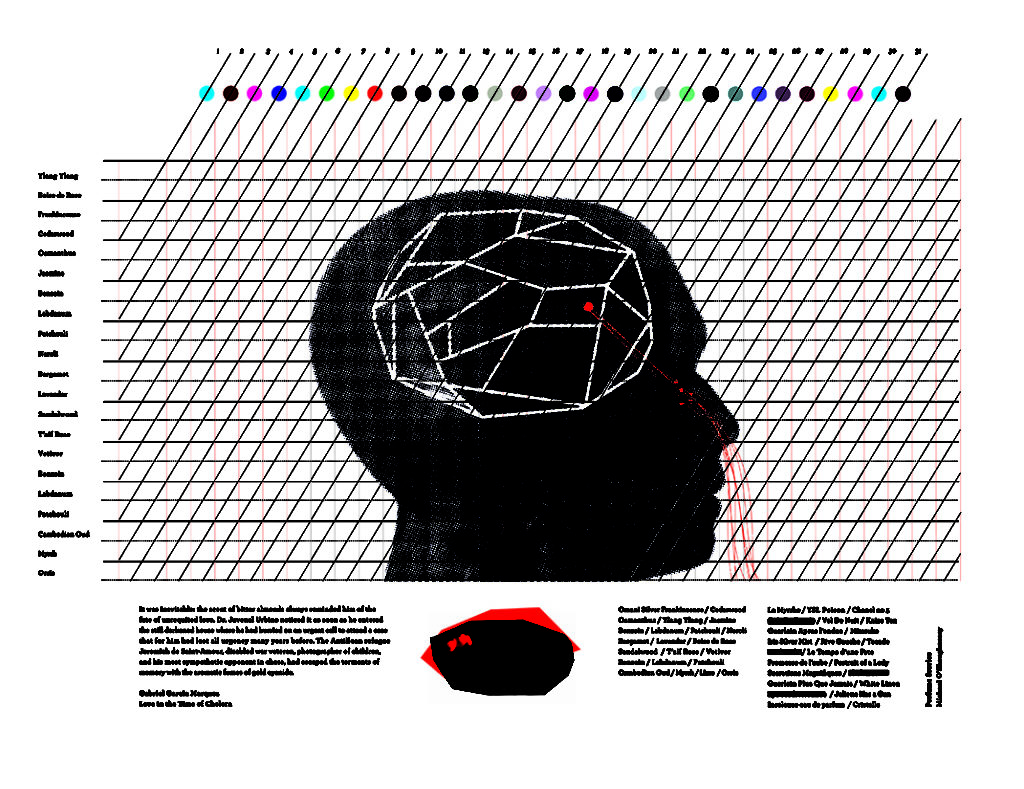
MOS: I loved the results. Actually it’s about people, and the interpretation of words being triggers. Because those words are handwritten, it’s a space between the artwork where people can look at them. Words can never be perfect. It’s interesting that each letter is made up of parts. When you actually see them on the wall, it’s quite interesting, it’s a culmination of something personal that is made up of composites.
WH: But I think it’s the same as if you write something on a piece of paper, you’re reading it at a distance where it’s size has a certain relationship to you. If you look at it like that you’d see it’s construction clearer. It’s similar in this case though, someone might go up to that wall and quite clearly see it’s made up out of parts.
LF: Yeah, and then they’d be really a substitute for the construction of each wall, each letter. Because the handwriting is constructed in the wall and the language is also being a construction.
WH: It’s clear that, if you write it in handwriting it becomes subjective. That relates in one direction from a segment, to eventually a word, or a Keyword. All it’s saying is that every single moment of that word’s construction is interpretable. It’s not just the interpretation of the word that’s on the wall, it’s the interpretation of every single piece that makes that word or even every single time that words is used in a different sentence or a different context, it’s constantly in flux, it’s constantly being transformed.
And I don’t think it was intentional, the ‘idea’ of handwriting only emphasises that. It’s more of the handwriting which emphasises the fluidity of that construction. In private, if you’re writing you go pretty quick, if you need to make that public it becomes disjointed and clunky and you build it up in a completely different way. So for me at least, there is that fluidity that is suggested in its production from the K to the E to the Y to the W and so on, but it’s actually not fluid at all; the way we write it, you don’t just get a marker and write that on the wall, you need this clunky influence in order for us to make it look like that.
MOS: It’s very controlled isn’t it, although it doesn’t look controlled. Where’s the margin of error? You know what I mean; the sort of fear you have facing a white wall, and you’re like, bang! That’s quite pressurised isn’t it.
WH: That’s also something that takes place in public – I’ve realised this week. Grant arrived this morning, and I said quite openly to him, we’re using words that are much better than the words we made in your exhibition! I’m not apologising for that, I’m just saying we’ve been practising in public, and that rehearsal in public makes it more fluid, more controlled
MOS: I think that’s quite interesting; it relates to [graffiti ]tags in someway, and how tags are signature, and how each tag is practised. It’s a skill, and the more you practice you’re going to nail it.
////////////////////////////////////////////////////////////////////////////////////////////////////////
Based on my own approach and some of my experiments with traditional calligraphy, I designed a drawing tool based on a Lyreco highlighter pen and Copic drawing chisel tip. When I’m drawing with a highlighter pen – I hold it in a different way to a Copic Drawing Pen. The idea was that they would sit in the palm of your hand when you’re writing. This allows you to draw and make marks rapidly from your wrist or change the length of the strokes by drawing from your elbow. The only issue was that the highlighter nibs aren’t strong enough and break easily. You wouldn’t hold them delicately with your fingers. I constructed a number of mdf versions of a highlighter and had the nibs laser cut from from composite board ( the nibs were based on Copic chisel tips – they were broad edged to offer a variation in stroke.

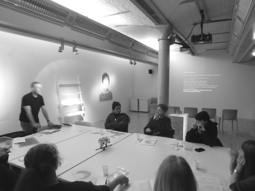
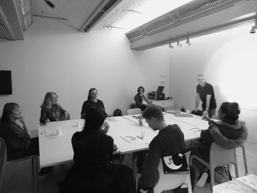
WORKSHOP 01
In March 2014 and April I worked with two groups of school children at Tate Liverpool. The Event was organised by the Education team at Tate Liverpool, Deborah Riding and Cathriona Burke. This was part of the Circuit 16 Educational Programme. The exhibition, Keywords, was to be one of the starting points for the Handwriting project-. Liverpool Poet Nathan Jones was invited to work with the students. His task was to get the students to respond to the Raymond Williams Exhibition – Producing their own Keywords. I worked with two different groups – each group were given the same text grid patterns and asked to produce handwriting based on the sessions with Nathan and the Tate team.
There were problems with the first prototype drawing pen designs, the composit board nibs broke up when dipped in ink. I decided to use Copic nibs and retain the MDF holders. There was an issue in the first work shop – pens had to be dipped in ink. First group of students didn’t have enough patience for this task, dipping the nibs, they didn’t hold enough ink. I remedied this in the final sessions, by having the nibs pre soaked in indian drawing ink.

WORKSHOP 02
Two 15 year old students from a South Sefton College produced a text inspired by Key Words but more importantly for the content – produced a body of words which reflected their own perspectives on Life IMAGE Education and Art. The revised drawing pens were more seamless, the lines more fluid. The students in this workshop were more productive. There were issues with the peer group mentality of the first groups. These final students produced text which was focused on their individual responses to the Art displayed at the Key Words Exhibition. A large scale graphic of these responses was eventually installed between floors three and four at Liverpool Tate. on17.04.14
This workshop did reveal something about how sophisticated the students calligraphy can quickly become, especially if they change the physical approach to handwriting. Holding these new pens gave some of them more control when producing a cursive style. This approach to writing as drawing may be factor empowering students to re engage with writing and learning ?


We may have a collective love affair with cursive text which stems from childhood nostalgia But the question remains ,Where does that leave a new generation of school kids ? Part signature part-graffiti, approaching this hybrid form could be a starting point. The problem could be it’s not an indicator of intelligence, it’s sign of rebellion, being cool. But does that matter ? Isn’t engaging with the process is what matters. Starting a dialogue.
////////////////////////////////////////////////////////////////////////////////////////////////////////
With reference to NYC Graffiti Artist Kase2 Style Wars / 1983 – I nicknamed this approach SuperDudeyWords. The writing as drawing would demonstrate a collision of controlled Calligraphy and tagging. The idea is that it conveys beauty. But there is something cerebral about the reaction of a pen and surface that this drawing approach offers. It mirrors the potential of the young people.
For some students marginalized by being perceived as less academic by showing the eloquence of this form of handwriting, it may empower them to embrace it as tool to express their identity . An empowering process. The Tate installation worked to a certain degree, but the audience remained within a an established Art Institution.
There are similarities at the heart of both projects. The Everyman Drawing Project was a success because of the fact that a similar redevelopment at The Philharmonic Hall was tagged after being in position for a couple of days. The Tate Project allowed students to approach drawing and handwriting from a different perspective. Whether it changed their perceptions of what they saw as good handwriting was difficult without follow up interviews. The drawing tools definitely allowed students to approach handwriting in a different way, through a combination of drawing and handwriting. The final graphic at Tate Liverpool, did have similarities to the Liverpool Everyman Project but lacked the scale and impact of the billboard images on Hope Street.
The projects spoke to a number of stakeholders – the wider Liverpool Public and the Graffiti community. It did raise some questions about handwriting, skill and intelligence. The Uniform and Everyman collaborative project wasn’t tagged or covered in Graffiti, despite being in place for nearly 18 months. Temporary structures like these do tend to fall victim to enterprising Taggers and Artists. Perhaps, the answer does lie in this appreciation of skill, but a skill the marginalised audience can respect. There maybe similarities found in the appreciation of skill other groups. The Illustrator and skateboarder James Jarvis discussed how Skateboarders adopt the architecture of the city as a landscape and backdrop, with myself and Dave Mackay proprietor of Lost Art Skateboards on Friday 27 February in 2015. This was a part of a Research initiative between LJMU and University Liverpool. Divergent Dialogues – Elusive Edge at Liverpool School of Art & Design
These public text based artworks have their roots in that D.I.Y DNA. There might be something in in how these elements, like the alchemy of drawing, permeates the value system of marginal groups.

SEPTEMBER 2016
Robertson Construction and Rachael Atkin contacted LJMU about academic involvement in a project. It was about a site at Kings Wharf in Birkenhead on Merseyside. A large construction site for a service station, part of the infrastructure for DONG Energy’s Burbo Bank Extension Offshore Windfarm.
Robertson Construction are constructing the windfarm’s operation and maintenance base, a building that will become a new feature of the Mersey riverfront, just as the giant wind turbines have become integral to the city’s horizon. Windfarms have become a feature on the landscape across the UK.
The site sits on the banks of the River Mersey. The opposite view of the site is the Liverpool Waterfront. A UNESCO World heritage site comprising of The Royal Liver building, the Cunard building and the Port of Liverpool building, collectively known as the Three Graces. They were built as a testament to the city’s great wealth as a trading port in the late 19th and early 20th centuries.
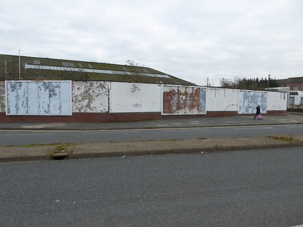
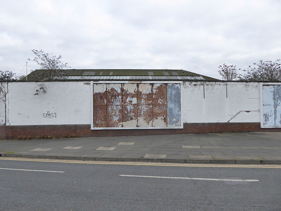
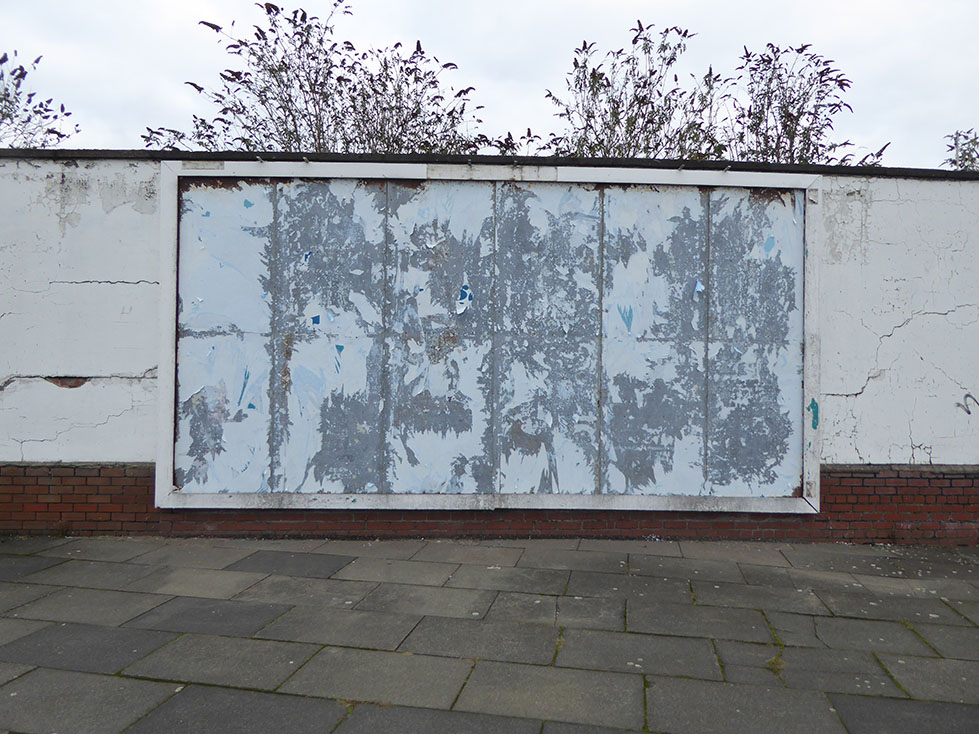
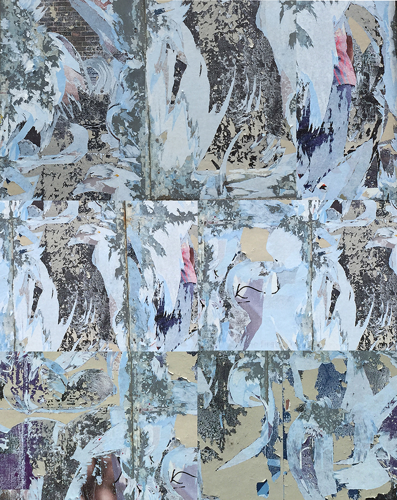
The some of Construction site is covered by a wall of 40 white wooden panels. This temporary wall sits 20 metres from the waters edge and faces one of the worlds most iconic waterfronts. There is limited footfall at the site but it does have public access and it is visible from the Mersey Ferry, the Belfast Ferry, the Pierhead and Liverpools Three Graces, the Royal Liver Building , the Cunard Building and the former offices of the Mersey Docks and Harbour Board.
The white panels at Kings Wharf had begun to attract tagging or ‘bombing’ – when grafitti artists paint or draw their names and slogans. Some were signatures and others appeared to be large scale works to mark a presence on the space. Both Robertson Construction were worried that such an exposed and public site, which can be seen across the Mersey and by the River Traffic, including the growing number of cruise ships which are coming to Liverpool, would be an eyesore.

Like my work on the Everyman reconstruction in 2012, I was asked to come up with a large scale graphic for the riverside of the hoardings. The design had to have something positive to say and would not attract the graffiti and potential vandalism that the present site was subject to. I did consider an alternative but trickier approach. To produce a graphic which would encourage tagging but within a specific space. I found an example of this in Paris.

Birkenhead and Wallasey are part of Greater Merseyside and both are part of significant regeneration scheme which runs along both sides of the waterfront.
For some Grafitti writers, there’s a certain democracy in seeing the city as a printable surface. Free spaces in which to make their mark. Sometimes there’s a lack of responsibility or any editorial filter . They can be indiscriminate. Any surface is fair game. It was this in mind that I submitted a design titled Please Don’t Stop Loving Me. The words had to be an affirmation of the city and its people?. A big criticism of graffiti is that it relies on the visual rather than explore ideas. A criticism is they have nothing to say. Lots of notable graffiti artists like Banksy have become famous with puns and one liners. Is there anything deeper to the meaning in the work ?
The aim as to to produce a message from one side of The River Mersey another. You can see the site from the Liver buildings in Liverpool. Liverpool’s musical and poetic heritage was at forefront of my mind when I came up with the concept.The Beatles were inspired by the RnB music that the sailors and Merchants brought back to Liverpool in the early 60’s. The subtext was about social responsibility. A provocation to the Grafitti artists. Please Don’t Stop Loving Me included a landscape of photographs. These were cropped and half seen images compiled from across the Liverpool Skyline, in particular Castle Street and Water Street. I was aware of the sensitivity surrounding Wind turbines and how they divided public opinion. My idea was that these structures, rather than being a blot on the landscape, drew our attention to monumental sky scapes and breathtaking cloud formations. All you had to do was to look up and see them.
The Large Scale Design for Kings Wharf used a graphic convention that explored the counterpoint between the autographic text and imagery.

There were a number of stakeholders involved in this project. Two Clients, Robertson Construction and Dong Energy. The Cruise Liner tourists and the people of Liverpool and Birkenhead. The most challenging stakeholder is the audience that is inclined to tag, bomb and make their own mark on these boards. It is arguably a creative community at the margins of Art & Design Practice. This after all, was a large scale, free canvas. Part of the original design was to include writing from local school children. This was going to sit at the foot of the panel. We contacted local schools with the aim of getting the schoolchildren to contribute something to this project. After input from the client, there were a number of revisions. The large scale text changed from Please Don’t Stop Loving Me to This Beautiful Place. The imagery and style would be the same with the inclusion of photographs of Dong Energy wind turbines. A change from five characters to three.
The final format for the design was 20 panels – 8 foot high x 4 feet wide. The Final Graphic had to work across 8 foot x 80 feet or 2.43 meters x m 24.384 meters.
THIS BEAUTIFUL SPACE
The text for this part of the project had to speak to a bigger audience. Getting legibility and clarity right for this type of handwritten text is always a real challenge. Taggers and Grafitti produce one word over and over again until it’s part of a single movement. These tags have to be completed quickly for a number of reasons, fear of prosecution is one. Designing these qualities into the final formatting of the panels is crucial. The Writing style has to appeal to this group of stakeholders. My own version is based on cursive text and is a composite of lots of different versions. This method normally involves me producing lots of drawing and editing. Sometimes a single word is made from four different versions. The aim is to make it look like a confident single mark. But for me, subtle shifts in line weight are Important and give it balance. The work can’t look too calligraphic otherwise it will alienate one of the audiences. This cursive style could be seen as too academic. It’s about getting the balance between the composed and spontaneous. The flourishes on the upper case T is a good example. It’s about trying to produce a hybrid of handwriting, writing as drawing. A combination of how the pens are made and held, plus lots of repetition. The aim is to give it the same assured confidence of Grafitti writers signature – but here it’s more applied and aware of the space. Like the Everyman, The text must include components found in ‘tagging’ on the streets of Liverpool.

I used some of the custom designed tools from The Tate workshop to create the handwriting for This Beautiful Place. They allow me to create marks with fluidity, urgency and control. The new designs were been in place for 3 months and like the Everyman Project remained un tagged or defaced. They were moved to another site before the Station was constructed and still remained untouched,


Post script / I interviewed Grafitti Artist, Thomas “TJ” Dolan
Thomas “TJ” Dolan, was a prolific and highly respected artist who was sentenced with his friend Thomas Whittaker in 2007 for 15 months at Manchester Crown Court for vandalising railway property. Dolan spray painted murals on trains, stations and other railway property across Greater Manchester. TJ used the tag, or name, Kreky. Kreky was a cartoon cat which became one of TJ’s central motifs. Thomas Whittaker used the tag name Mers. Between them, the young men, from Macclesfield in Cheshire, caused £13,000 worth of damage. They were caught when British Transport Police found images of their work on websites which were used to showcase the work. Kreky still a highly respected artist within this tightly knit community and continues to worked on public and private commissions throughout the UK.
It was interesting to discover that it is only the British Transport Police that actively prosecute anyone for graffiti. This is a fact that is acknowledged and well understood, throughout this community. The lack of a legal action outside of the British Rail environment appears could be one of the issues about the ubiquity of graffiti.
I was really interested in TJ’s opinion about the Robertson Construction graphic. Would it be tagged if it were it was in place for longer or in a different environment ? He did eluded to the fact that there is a code amongst the senior and very established artists, that they wouldn’t tag over each others artwork. Within this community its not uncommon to spot and identify styles and approaches. This was an unspoken code. The style of the This Beautiful Place Graphic would appeal to this senior and established set of artists. He felt that the Robertson Construction and Dong Energy artwork would be left alone. With a shifting student economy, it is very common for ‘students’ to tag their new adopted city by way of a declaration. These tags tend to be in city centers – a call card to other students. There will always be short term and fake taggers known as ‘toys’. These tend to be opportunists who don’t recognise rules or unspoken hierarchies.

The simplest and most effective way to factor in an anti vandal designs without costly surface treatments – is very simply to leave less free negative space to tag. In simple terms – offer less of a canvas within the canvas.
Thanks TJ Dolan / Charlie Backhouse Editor Dr. David Heathcote
Special thanks to Rachael Atkin of Robertson Construction UK


Copyright (c) Studio Editions 2017
www.studioeditions.co.uk