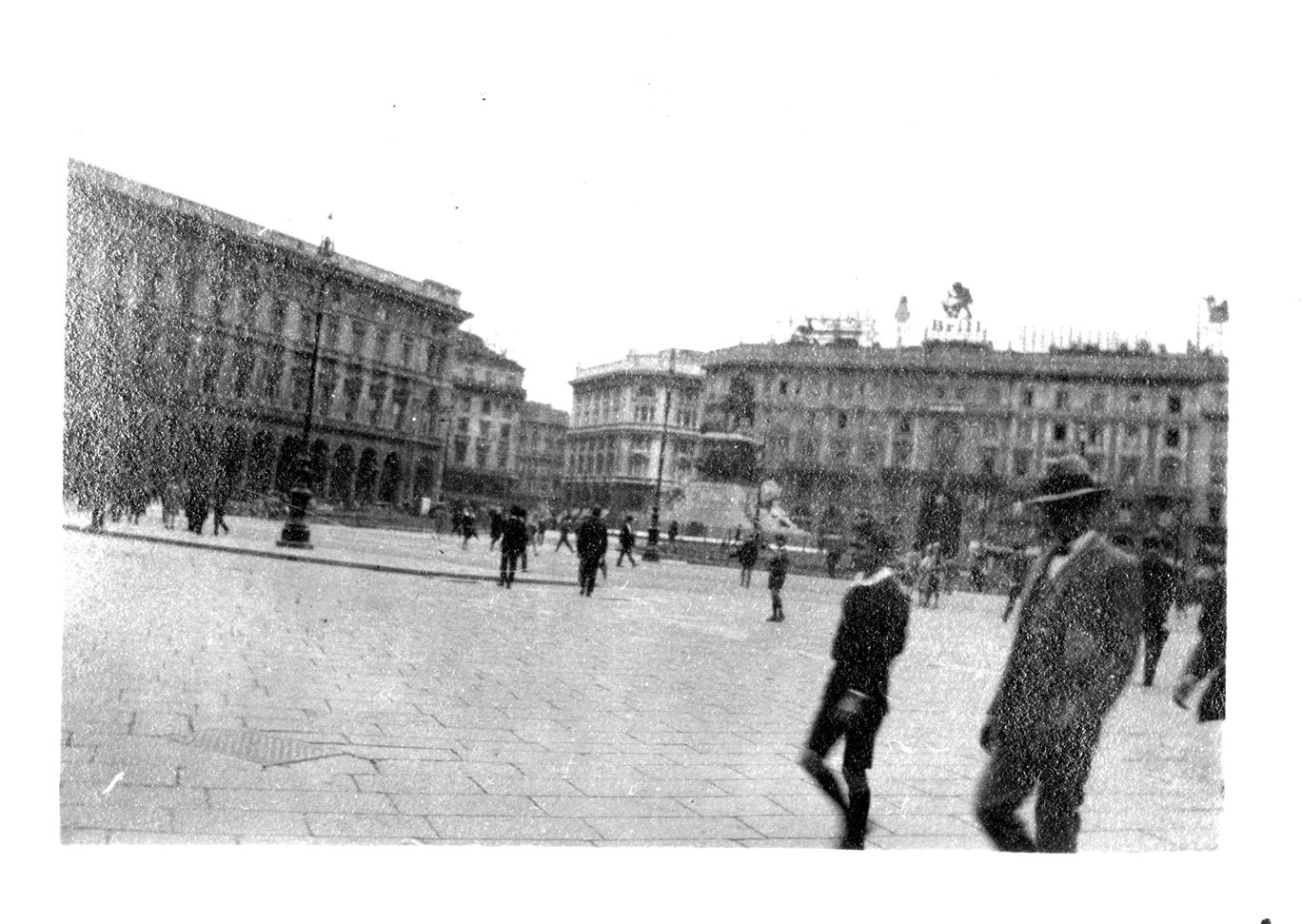
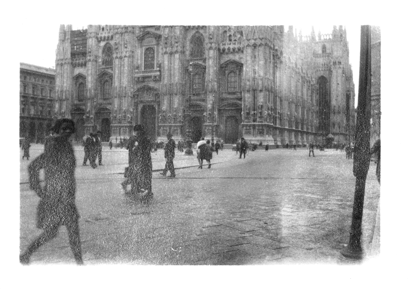
These aren’t my summer photographs. This a set of photographs from a great antique / junk shop in St John’s Road Waterloo. I bought the whole album. It’s someones life. The photographs belong to the dude in the hat, staring back at the camera. Between the wars. The Cathedral is Duomo Di Milano. It’s one of the largest Gothic Cathedrals in the World. St.Johns Road is a million miles from Milan.
NonCalligraphy + SuperDudeyWords
Artist Teachers Workshop: Non Calligraphy / SuperDudeyWords
For two days this summer, I worked with a group of Art Teachers from schools in the North West of England. Katie Musgrove / Ged Doolan / David McDowell / Gill Hislop / Christopher Eplett / Emma Sullivan / Andrea Mackintosh / Liz Shelbourne / Hannah West. All the staff had different undergraduate degrees.
The teachers were asked to choose and worked from selected text – A Midsummer Night’s Dream; William Shakespeare / Late Fragment; Raymond Carver / Judy is a Punk; The Ramones. The group produced a single large format publication and a film documenting the event and book. For the eagle eyed amongst you, the cool, older fella in black is me. One aspect of the day was working on my SuperDudeyWords project – using my custom made writing pens. Non of the teachers were sent out of class or given lines.
Technical support from the Liverpool School of Art & Design – Super A Team; Andy Freeney + Caros Santos .
Music was a little known Chicago Acid House track, my Sweatshirt was by Cahartt
The event was organised by Sandra Hiatt – More words to follow.
perfume film
This is a short film of my Perfume and Drawing publication. It’s hardly a classic like Taxi Driver, Citizen Kane or, the all time great, Porky’s III. I’m working on another film, which will be much much better.
My Latest favourite scent is Frederic Malle for Dries Van Noten. Etat Libre D’Orange is a new Perfume House and the winner of the Perfume range with the best names – Malaise of The 1970’s and Fat Electrician.
Music: Angela Hewitt / Bach Toccatta in E Minor.
Small hairy folk hands: MOS
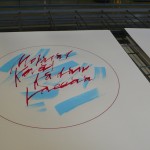
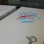
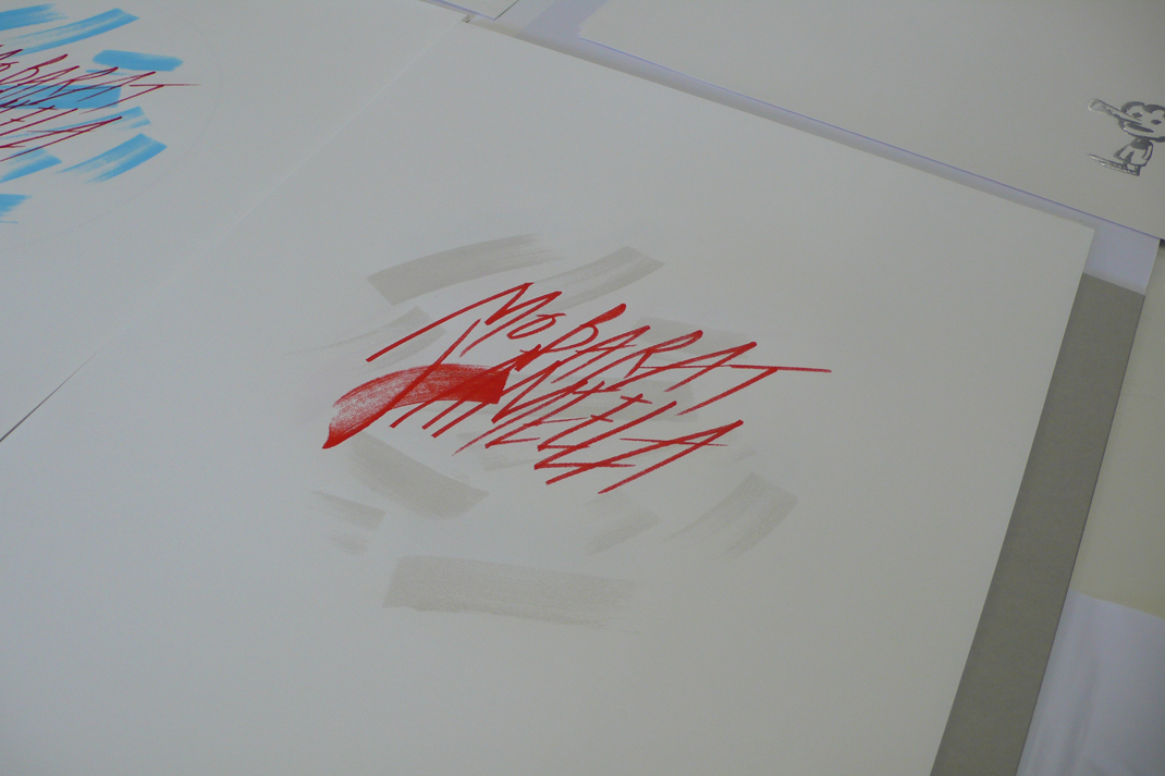
Mobarat Jameela
Football is the great leveller. We all hate Chelsea and ITV’s coverage of The World Cup. We all love Liverpool Football Club and Lionel Messi. This is my latest Arabic vibe. There isn’t a translation of Beautiful Game but my friend Hatana assures me Mobarat Jameela and Mobarat Korat Kadam Kaeeaa are very close. This isn’t my cynical attempt to get an invite to the World Cup in Qatar, but I would go, If asked. My football mascot character Vuvu is tipping Arjen Robben, not to dive in the next World Cup game.
Limited Editioned Screen Prints – All prints are signed / foil blocked and screen printed on 200gsm Fabriano Academia. Prints are A2 in size – 420 mm wide x 594 mm high.
Watch this space. Proceeds of an upcoming auction of this work will be donated to refugees in Syria and Gaza. The Event is organised by Hatana El Jarn. More details to follow @mickeyshona
football + hyperreality
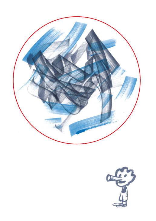
This is my contribution to http://www.idontlovesoccer.co.uk/ It’s a publication and Exhibition – part of a Liverpool Art School Graphic Design & Illustration Staff Project, based on an essay by Umberto Eco. Myself and colleagues have produced a riso Publication and Exhibition in celebration of the World Cup 2014. We’ve had a low key launch at Liverpool best and coolest coffee and scran gaff – the legendary Bold Street Coffee. If you’re really clever you should be able to work out what the text says. If, like me and Stephen Hawking you’re off the scale – see if you can work out the significance of the blue marks.
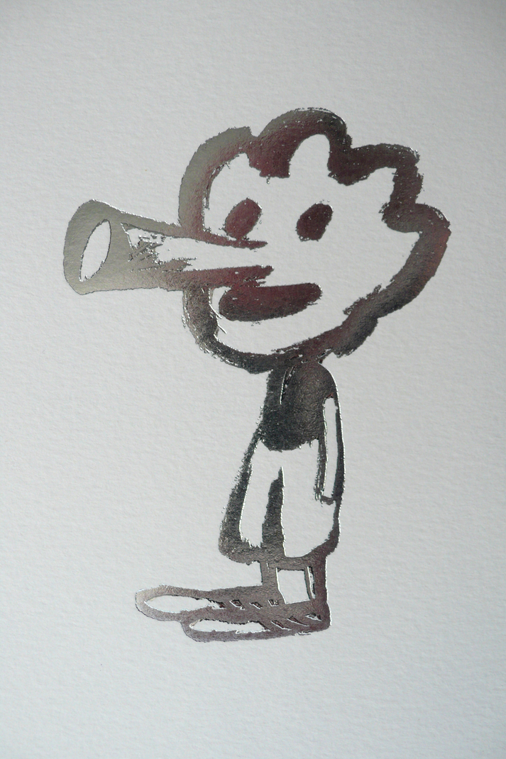
I created a foil blocked character Vuvu, he’s based on all those irrelevant football mascots that end up in the bargain bins. you’ll see him used throughout the summer on a series of editioned screen prints, I’m producing. Sepp Blatter keeps texting, asking if he can have a free print.
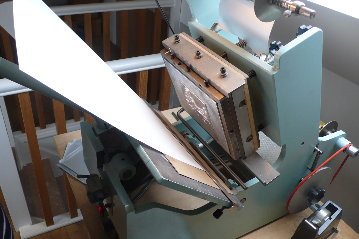
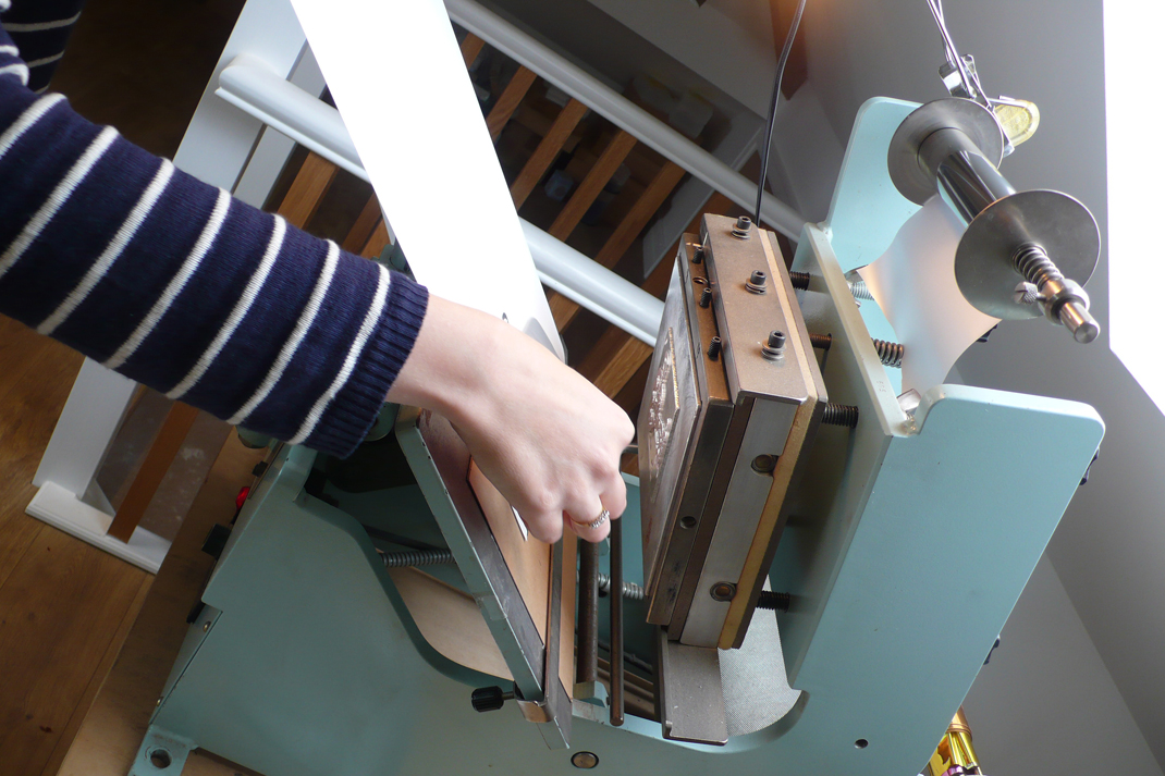
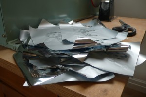
Below: is a foil blocked detail – The foil blocking is was applied by Wendy from the small but perfectly brilliant design studio Stride Studio – Watch this space
gold shoes
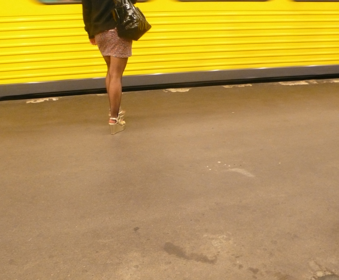
Summer is almost here. I though I’d share a photo from my last trip to Berlin. It’s a sneaky shot, this girl in those gold shoes and that yellow train. Mitte is full of euro jet setters, uber coolers and tall girls on bikes. If you go to Berlin, you’ve got to check out the Pergamon Alter. Like the British, the Germans used to go around the world nicking famous antiquities and claiming them as their own. These wedges looked paid for.
Vogue
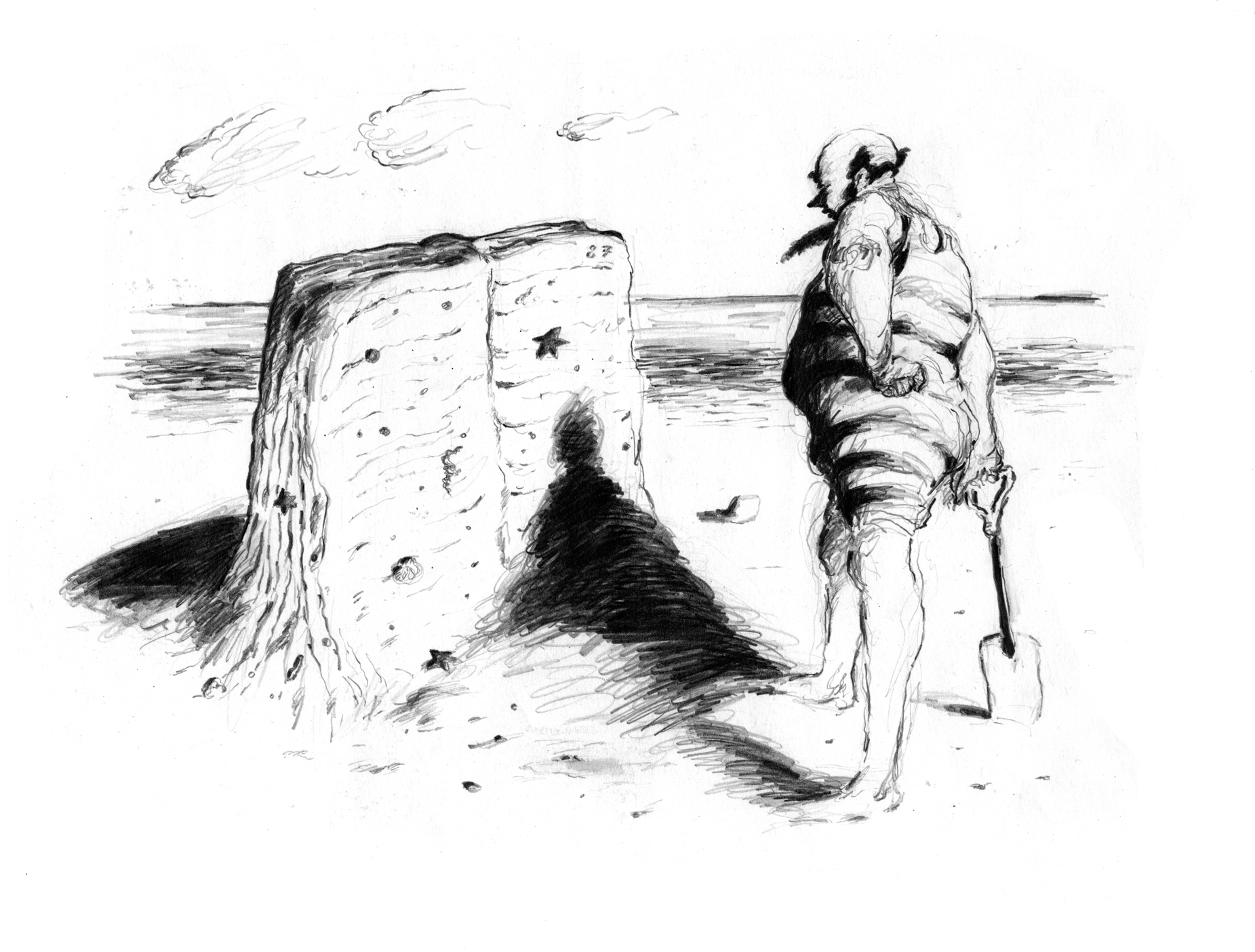
As we are still on that old school dayz trip – This was my first Illustration for Vogue Magazine from 1987. I assumed Vogue was staffed by supermodels, but found instead, lots of posh gals in pearl earrings with private incomes. The article was about paperbacks that you would read on a beach in summer. The character looks a lot like one of my old tutors, Tubb Williams. These days, Vogue doesn’t appear to commission much in the way of Illustration, but there’s plenty of photos of posh people with private incomes.
I think I spent the fee on ice cream and fizzy pop.
Gabriel Garcia Marquez
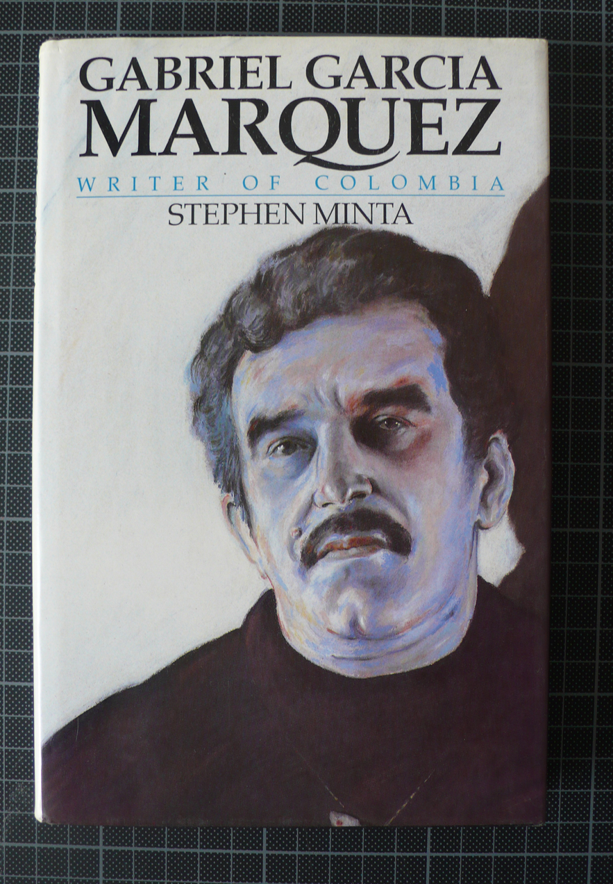
Gabriel Garcia Marquez 1927 – 2014. The brilliant South American writer has died. This was my first portrait commissioned when I left college in 1986. I was asked by publishers Jonathan Cape to produce a portrait of the Columbian writer. It’s a little conservative and hardly my best work. In one of my roughs, I had him dressed as a fish. Yikes ! But I got to become a lifelong Marquez fan. Love in the Time of Cholera – this is an opening line of pure genius –
“It was inevitable: the scent of bitter almonds always reminded him of the fate of unrequited love”
Tate + SuperdudeywordStuffs
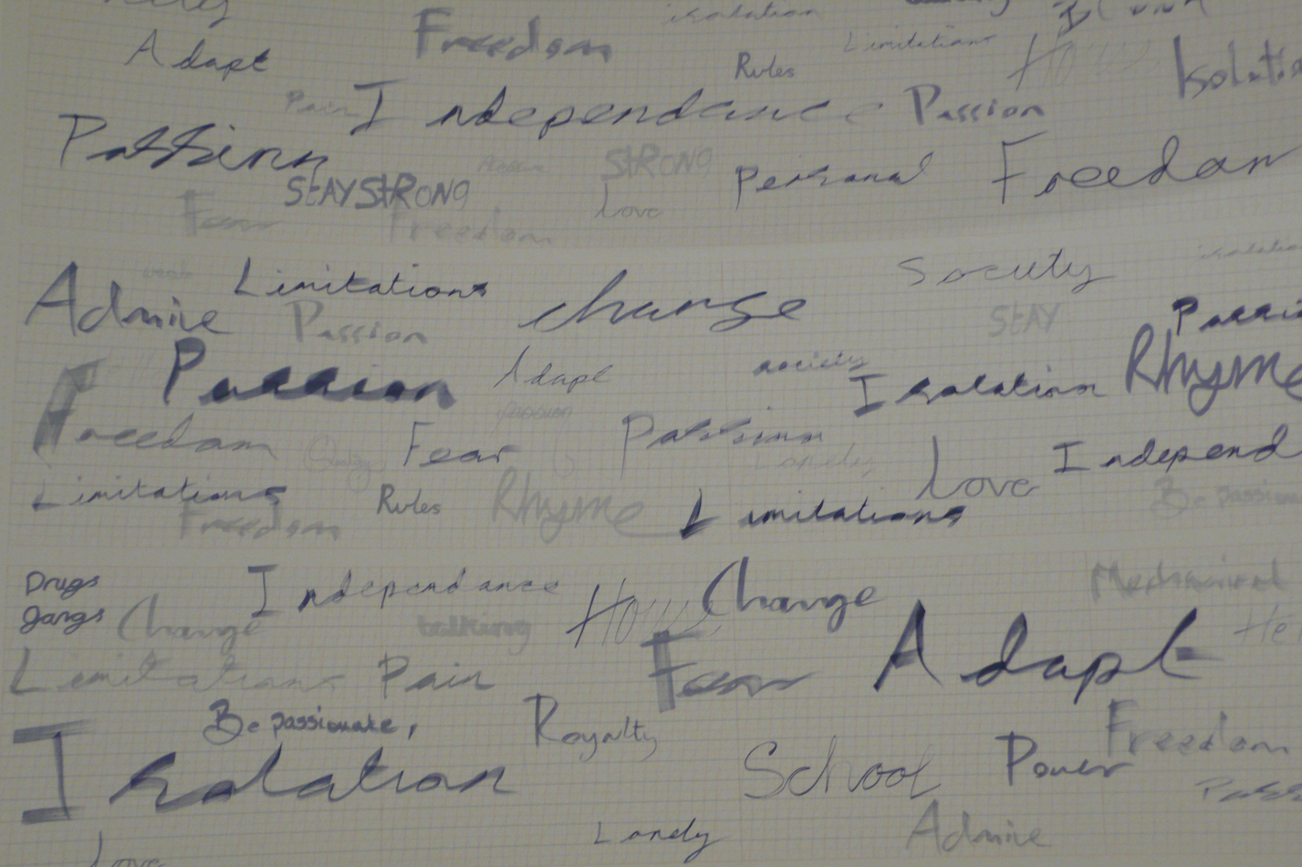
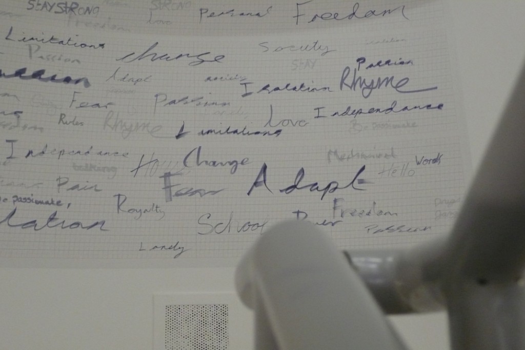
Big Thanks to Deborah Riding and everyone at Tate Liverpool. My wall image has finally been installed. This was the culmination of three workshop sessions and three groups of very cool Liverpool School Kids. More details about this to follow. The original wall graphic was designed to work on a large scale. The Tate installation is smaller than I’d hoped for – if I can get the little fella from Game of Thrones to pose next to it, I might post more photos.
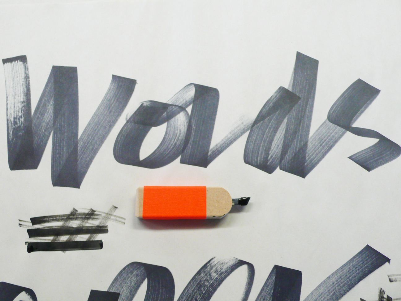
I reworked my Super Gizmo Drawing Tools. I’ve had to copyright them, all the top pen people now want a piece of this action.
Supadudeywords part 2
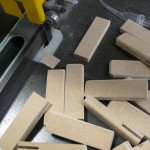
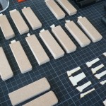
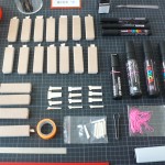
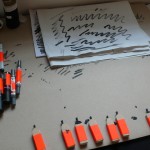
This is the second stage of my project Supadudeywords. I made a set of custom drawing tools. The original nibs were laser cut in the FabLab at Liverpool School of Art & Design. They were a right disaster, the first versions were cut from composite board. They fell apart as soon at they were dipped in ink. I ended up using Copic chisel tip nibs. The holders were based on highlighter markers.
I spent a day working with poet Nathan Jones and two schools at Tate Liverpool – De La Salle Academy from Croxteth and University Academy Liverpool. They were clever, very cool Liverpool kids. I wore my gold High Tops and Soul 2 Soul snap back cap. I think the kids thought I had street cred.

