Berlin v Liverpool

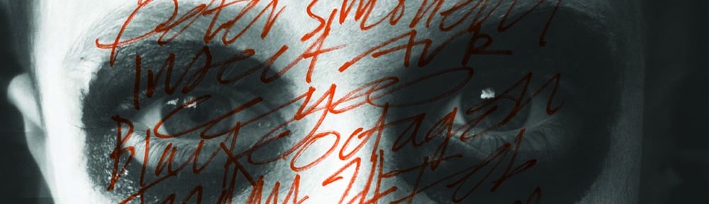
This section is an update on one of my latest Research Projects. Berlin is such a super duper uber place. It’s very similar to Liverpool but without the bull terriers and girls wearing hair curlers in the middle of the day. Full of beautiful and grandiose buildings. It’s also covered in grafitti. I was really looking for calligraphic styles that are made from a singular, automatic action. Much like a flamboyant and cursive signature. The Liverpool bits are normally hidden away down backstreets, unlike their Berlin counterparts which are often found in some of the smartest streets. Much of the soul that has been lost with the decline handwriting in schools, is finding a new but different voice. Super Dudey Words.


Earling & playbutton

I’ve worked on a quite a few projects with Geoff Dolman from Static Caravan Records http://www.staticcaravan.org/ They are always discovering and supporting original new sounds. This was a limited release produced by http://playbutton.com/ . It features Hannah Peel on vocals, Coti K – double bass and file manipulations, Laurence Hunt on percussion, and Justin Wiggan on electronics and synths. 

The play button contains the audio, which starts automatically when you plug headphones or the USB connector into the headphone jack. I was given free reign on this project. The stone was photographed in a recycling site near Formby.

Flann O’Brien archive

One of my favourite oldie tyme illustration projects . Commissioned by Harper Collins – Flann O’Brien. They’re great books and quintessentially Irish. It was fate that I’d end up working on them. The protagonist in The Dalkey Archive is Michael Shaughnessy. The character of the brother in The Best of Myles, is genius.  I’m starting to look like one of the old geezers on the front.


pencils & grids part one

It’s not that I’ve got OCD, like Josef Muller-Brockmann, I love grids and straight lines. I’ve also returned to my collecting theme. Finding the perfect things to make good work can take years. The right pencil. A magenta pin from RSVP in Berlin. The concept behind the text is much harder to find.The final image is one of my favourite shop windows in London.


Elbow archive

Elbow / Leaders of the Free World. This is such a great album. But was poorly promoted by their record label at the time – V2. Universal have just released another version. The design is good but they’ve scrimped on the paper quality. I always preferred the working drawings to the finished artwork.

iceberg

I was given this fabulous old photo years ago.There’s a great story here. I’m not sure what it is ? Edward Hopper would have liked it. Collecting is big part of what all illustrators and designers do. There’ll be much more on this archiving theme, in later posts. Perhaps, this bloke is just thinking. F**k that was close !

ghost of gone birds

A detail and print made for Ghost of Gone Birds. This was such a wonderful project to be involved with. We hosted the exhibition / project at Liverpool School of Art & Design for Ceri Levy and Good Pilot team. http://www.ghostsofgonebirds.com.                                                           Each artist / illustrator / designer  could choose an extinct bird, or a bird on the endangered list. I chose the South Island Piopio. It was an ugly little fella, but had a lovely song. A bit like Kanye West or Cee Lo Green. If you’re clever, you’ll notice that all my names are great singers, who have passed away. The style is part of an ongoing research project on  calligraphy and street writing / tags.

Deertz and Kidult

Saw this on my last Berlin trip – A.D.Deertz is a Berlin based casual menswear label. The clothes are pretty good. A bit like http://www.oipolloi.com but without all the Fisherman’s jumpers and black eyes. The graffiti is a definite improvement on the signage. The contrast of the two styles of information really complements it.  Once you look beyond the expletives and the garbage. – There are some lovely bits of writing out there. I’ll be putting up some regular posts on this subject.

Kidult at Agnes B in Paris- which is amazing. You do wonder about the complicity of the people at Agnes B and Deertz. That shade of cyan, it’s just too considered. Plus, Agnes B is a label which is bought by people who live in Kensington and pretend to like jazz. Are they trying to give it a bit of street cool ? You get me ?